Perfect Property
Career Foundry UI Case Study Responsive Web App
December 2023
Mentor: Michell Coutinho
The Problem Statement.
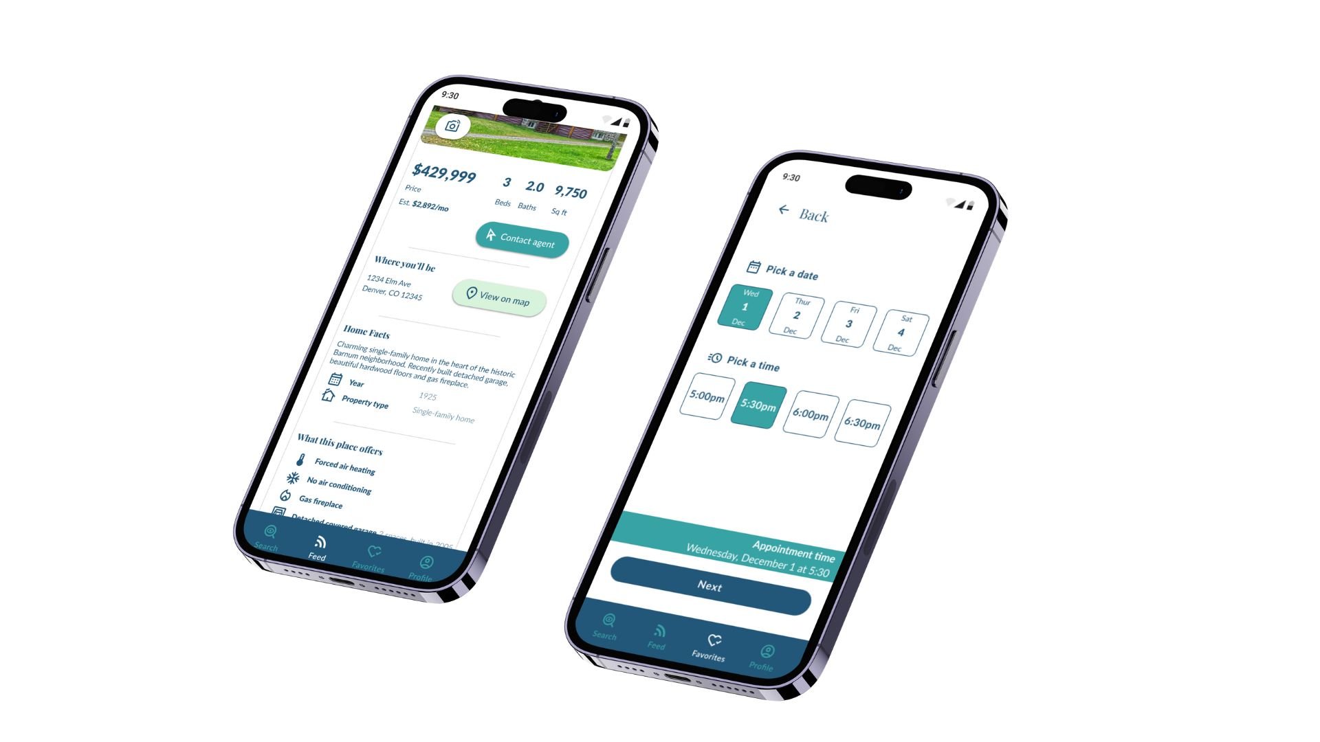
Create a real estate app for busy professionals who want to get into the property market without wasting time viewing properties that don’t fit their qualifications.
The Solution.
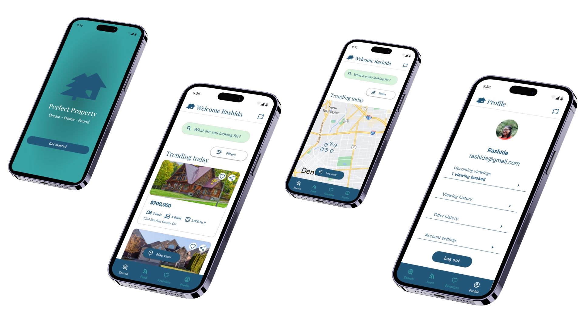
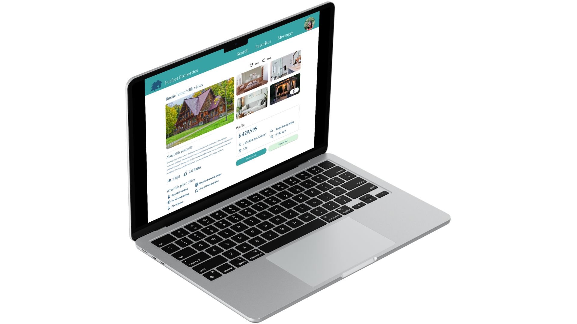
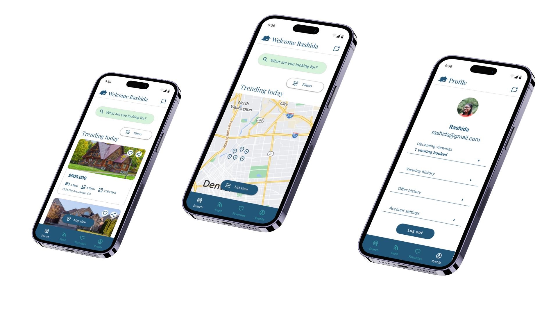
Perfect Property is a responsive web app for new property buyers looking to invest efficiently for financial security. I created a responsive web app that reflects the intuitive, naturalistic feel of the brand.
Role and Methodology.
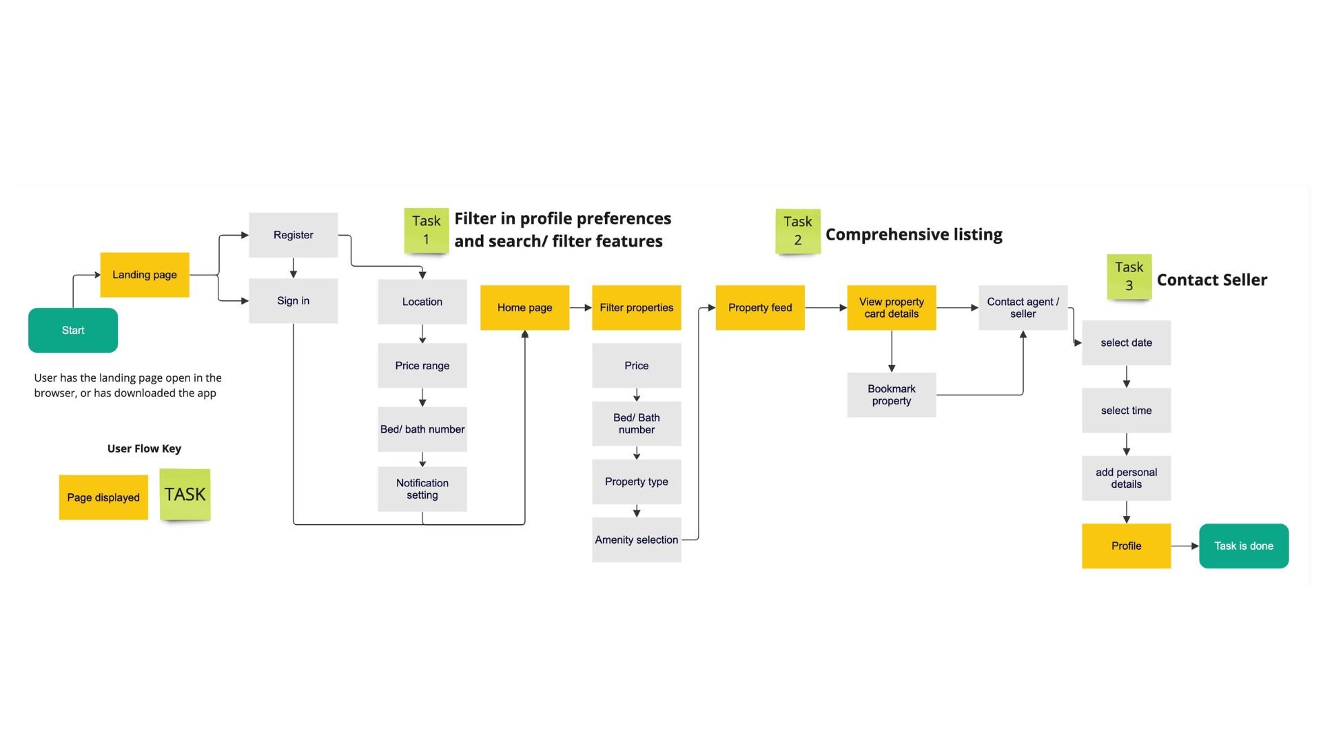
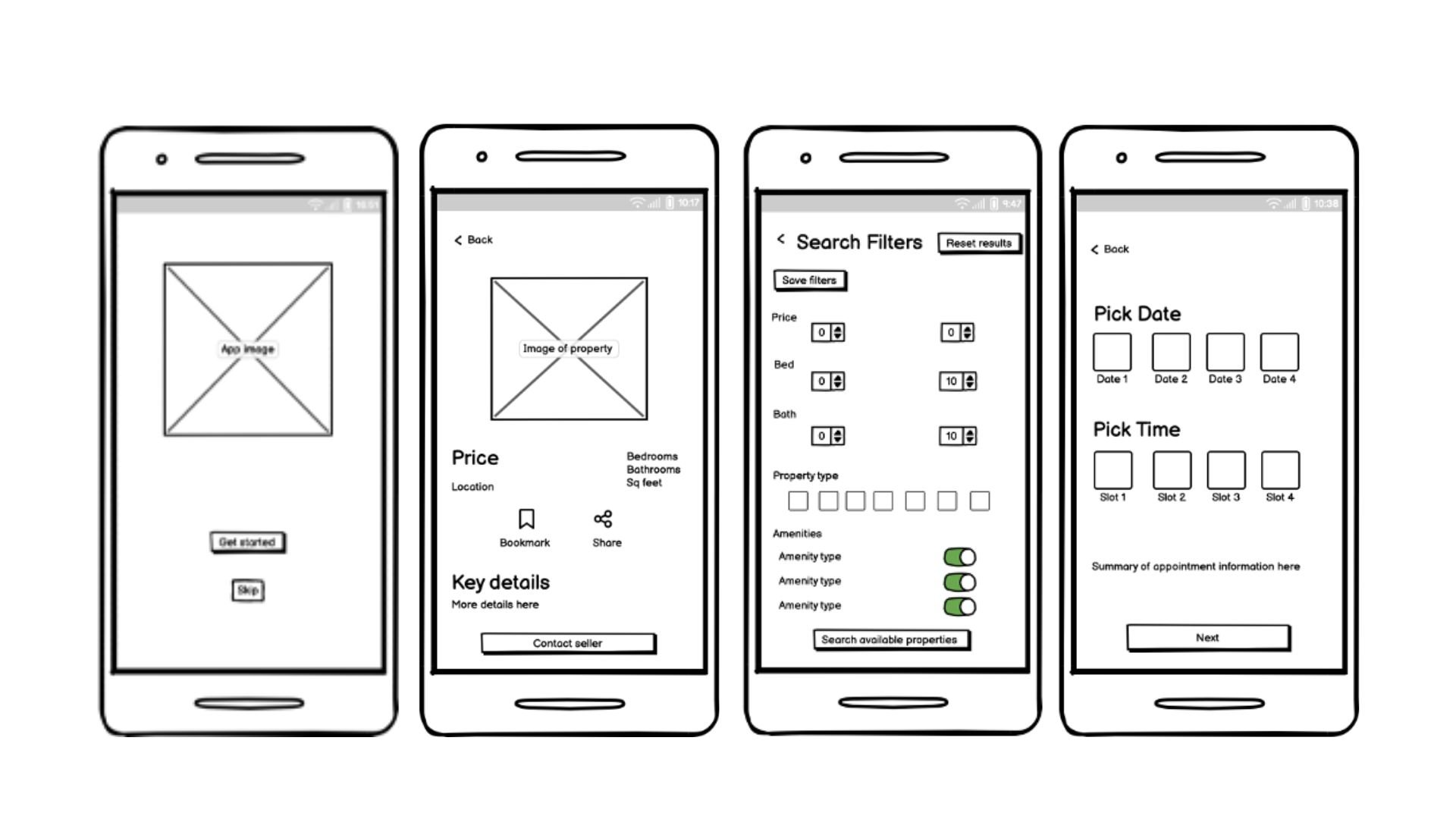
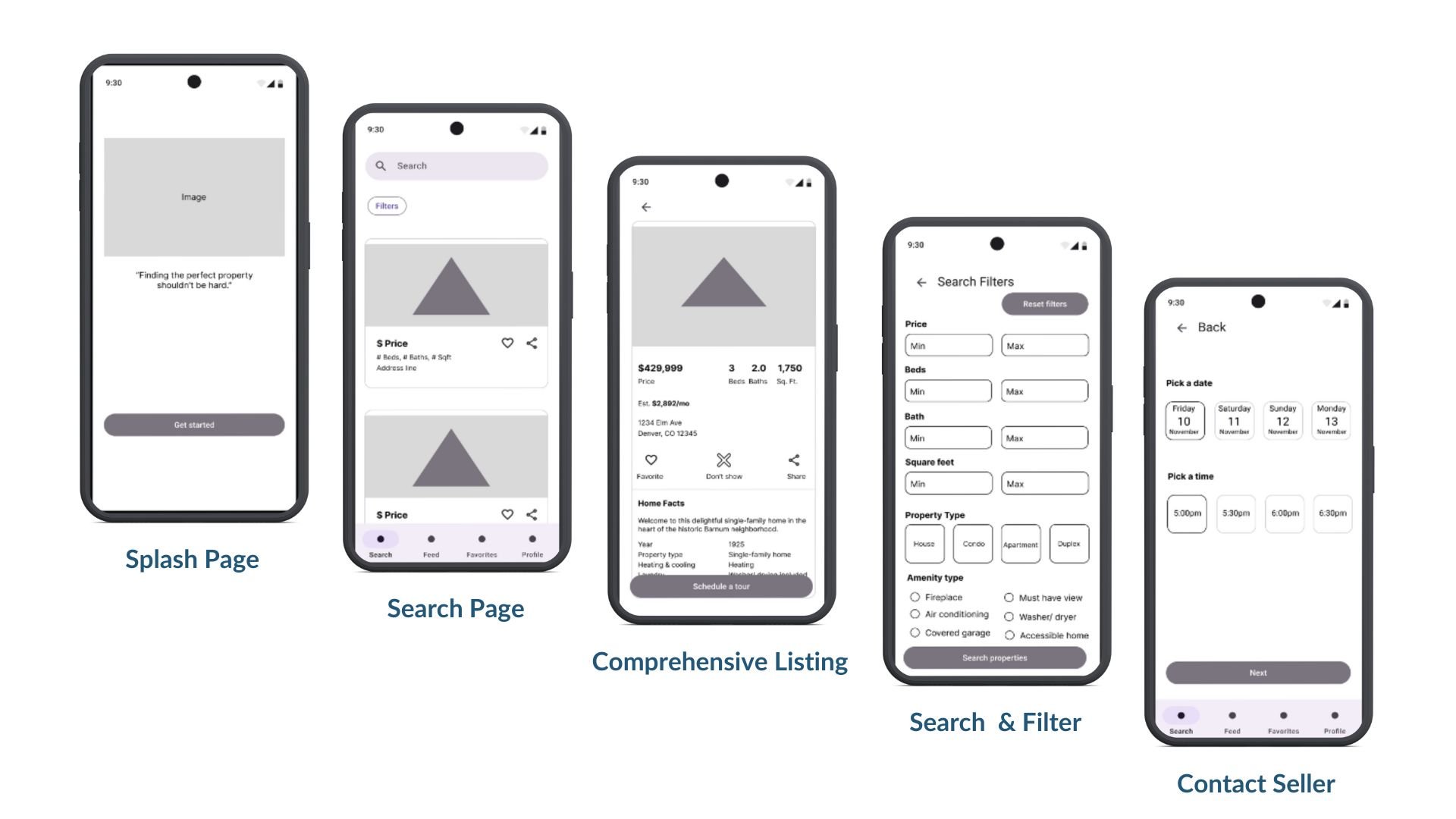
I was the designer for this project. In the discovery phase I interpreted the brief and then gathered inspiration for my designs, using what I found to conceptualize the visual identity and brand guidelines. I conducted a task analysis and created user flows based on these tasks. I sketched the low-fidelity screens before using Figma to create mid-fidelity digital wireframes, then high fidelity screens and an interactive prototype.
What I learned.
I designed Perfect Property for a course project and what I learned was that using existing apps as inspiration can be helpful to learn about design best practices.
My challenge for this project was to understand how to use white space to make a more effective User Experience. I identified this challenge by comparing my first round of designs to existing property apps and noticing that my designs looked crowded. I discussed this observation with my mentor and she recommended that I use these apps as inspiration for spacing choices.
I thine chose a few spacing examples to replicate throughout my app. Specifically, the padding around the images and the product cards, and the spacing between product cards themselves. These choices improved the cleanness of my designs.
